By understanding and applying the following design principles, restaurants can optimise their digital menus to improve the overall dining experience, promote key items, and ultimately, drive sales.
Design Aesthetics for Digital Menus
Design aesthetics play a pivotal role in the effectiveness of digital menu boards, influencing both the attractiveness of the display and the customer's decision-making process. A well-designed digital menu goes beyond mere visuals; it communicates the brand's ethos, sets the tone for the dining experience, and guides customers through the menu offerings efficiently. Here, we explore the key elements that contribute to the design aesthetics of digital menus.
How to I create the visual appeal and theme for my digital menus?
The visual appeal of a digital menu board is the first impression on a customer. It encompasses the overall look and feel of the display, including the choice of images, colour palette, and layout. Theming should reflect the type of food and the ambiance of the eatery. For instance, a cozy café might opt for warm tones and rustic imagery, while a modern fast-food chain could choose bold colours and ‘get what you see’ design.
What type of imagery and graphics do I need?
High-quality images and graphics are critical to significantly enhance the appeal of a digital menu. They provide a visual representation of the offerings, making the menu items more enticing. However, it's crucial to balance imagery with text to avoid overwhelming the viewer. The emphasis on graphics that align with the brand's identity can also add to the menu's aesthetic appeal.
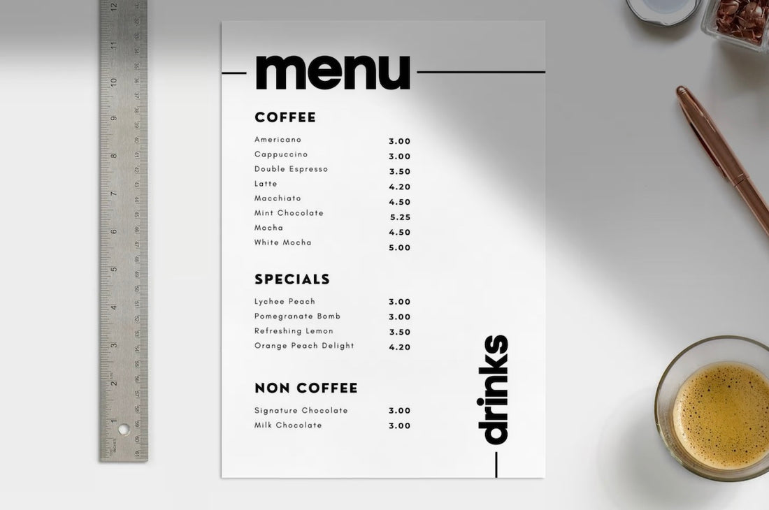
What is the best way to layout and organise a digital menu?
The organisation of menu items plays a crucial role in the menu's functionality and aesthetics. A cluttered or illogically arranged menu can frustrate customers and detract from the dining experience. Effective digital menus use layout strategies to categorise items logically, making it easy for customers to navigate the menu offer. The use of sections, borders, and spacing can help achieve a balance between aesthetics and functionality.
Why is consistency needed when designing a digital menu?
Consistency in design elements such as colour schemes, fonts, and imagery reinforces the brand's identity and contributes to a cohesive customer experience. It's essential for the digital menu to reflect the overall branding of the establishment, including any physical menus, signage, and marketing materials.
By prioritising design aesthetics, restaurants and cafes can create digital menus that not only look appealing but also enhance the customer experience, making it easier for patrons to make selections and ultimately drive sales.
Choosing the Right Colour Schemes
The colour scheme of a digital menu board is more than just an aesthetic choice; it plays a crucial role in influencing customer emotions, perceptions, and behaviours. Colours can evoke specific feelings, convey brand values, and highlight key menu items.
What influences colours in menu design?
Understanding the psychological impact of colours is crucial in menu design. For instance, red is known to stimulate appetite and attract attention, making it a popular choice for fast-food chains. Green evokes freshness and health, ideal for establishments focusing on salads or vegetarian options. Blue, while calming, is seldom used in food-related contexts as it's believed to suppress appetite. Selecting a colour scheme that aligns with the type of food served and the ambiance you wish to create is essential.
How do I increase readability with colour?
Readability is paramount for digital menu boards. High contrast between the background and text ensures that all customers, regardless of their distance from the screen or the lighting conditions, can easily read the menu. A common effective practice is to use dark text on a light background or vice versa. It's also important to test the visibility of your colour scheme in different lighting conditions, especially if the digital menu is placed near windows or outdoors.
How do I align colour choice with brand identity?
The colours chosen for the digital menu should be consistent with the establishment's overall branding. This consistency reinforces brand recognition and provides a cohesive customer experience across all touch points. If your brand already has a defined colour palette, incorporate these colours into the digital menu design. For brands without a defined palette, consider the emotions and values you want to convey through your brand and select colours accordingly.
Examples of Effective Colour Schemes
- Fast Food Restaurants: Bright and bold colours like red, yellow, and orange can create a sense of urgency and appeal, encouraging quick decision-making.
- Cafes and Bakeries: Warm tones such as brown, beige, and cream, paired with pastel accents, offer a cozy and inviting atmosphere.
- Healthy Eateries: Green tones, combined with white and natural wood textures, can emphasise freshness and natural ingredients.
Choosing the right colour scheme for your digital menu board requires a balance between aesthetic appeal, readability, and brand alignment. By carefully selecting colours that resonate with your target audience and enhance the menu's visibility, you can create a digital display that not only looks appealing but also effectively communicate emotion in your menu which will further encourage a purchase.
Typography and Readability
Typography, the art of arranging type, plays a crucial role in the design of digital menu boards. It not only contributes to the aesthetic appeal of the menu but also significantly impacts readability and the overall customer experience. This section will cover guidelines for choosing fonts that are legible, aesthetically pleasing, and aligned with the brand's personality, alongside strategies for balancing font sizes, styles, and spacing.
What is the importance of typography in Menu Design?
The choice of typography can convey a range of emotions and associations, from the sophistication of a fine dining experience to the casual vibe of a street food stall. Beyond aesthetics, the primary goal of typography in menu design is to ensure that customers can easily read and understand the offerings. Clear, legible fonts reduce order times, improve accuracy, and enhance customer satisfaction.
Guidelines for Choosing Fonts
- Legibility: Choose fonts that are easy to read from a distance. Sans-serif fonts, known for their clean lines and simple forms, are often more legible in digital formats than serif fonts.
- Brand Alignment: The font should reflect the establishment's character and ambiance. A playful, handwritten font might be appropriate for a family-friendly café, while a sleek, modern typeface could suit a contemporary fast-food restaurant.
- Variety and Hierarchy: Utilising different font sizes, weights, and colours can create a hierarchy, making it easier for customers to navigate the menu. Highlight key items or sections using bolder fonts or different colours, but limit the number of font styles to avoid clutter.
Balancing Font Sizes, Styles, and Spacing
- Consistency: Apply consistent rules across the menu for font sizes and styles, based on the hierarchy of information. For example, main categories might be in a larger size or different colour, while descriptions remain in a smaller, simpler font.
- Spacing: Adequate spacing between lines and around text blocks improves readability and gives the menu a more organised appearance. Overcrowded text can be overwhelming and difficult to read.
- Contrast and Background: Ensure there is sufficient contrast between the text and the background. Dark text on a light background or vice versa can significantly enhance legibility. Avoid placing text over busy images or patterns that could detract from the text.
Enhancing Readability with Typography
Effective typography is more than just choosing the right font; it's about creating a seamless experience for the customer. Digital menus should be designed with the understanding that customers may have limited time and varying levels of visual clarity. By prioritising legibility, aligning typography with the brand's identity, and using hierarchy and spacing wisely, restaurants can design digital menus that not only captivate the eye but also facilitate a smooth ordering process.
Incorporating Branding and Identity
The integration of branding and identity into digital menu board design is essential for creating a memorable and cohesive customer experience. This approach ensures that every aspect of the menu reflects the unique attributes and ethos of the establishment, from the colour scheme and typography to the imagery and messaging. This section will discuss strategies for embedding brand elements into the digital menu design, maintaining consistency across digital and physical platforms, and leveraging the menu as a tool for brand reinforcement.
What are the best strategies for integrating brand elements?
- Logo and Brand Marks: Incorporate your logo and any brand marks prominently but unobtrusively on the menu. This could be at the top, bottom, or corners of the display, ensuring it's visible without overshadowing the menu content.
- Colour Palette: Use your brand's colour palette throughout the menu. This includes text, backgrounds, buttons, and any decorative elements. Consistent use of brand colours reinforces brand recognition and enhances the visual coherence of the menu.
- Font Selection: If your brand has specific fonts associated with it, incorporate these into the menu. Consistency in typography strengthens brand identity and contributes to a unified brand experience across all customer touch points.
- Imagery and Graphics: Use imagery and graphics that align with your brand's style and values. This could include photographs of your dishes, illustrated elements that reflect your brand's theme, or graphical accents that complement your brand's aesthetics.
Maintaining Consistency Across Platforms
Digital menu boards are often part of a broader ecosystem of brand touchpoints, including websites, social media, physical menus, and marketing materials. Ensuring a consistent look and feel across all these platforms is crucial for building a strong brand identity. This consistency helps in creating a seamless experience for the customer, making your brand more memorable and increasing customer loyalty.
Leveraging Menus as a Branding Tool
Digital menus offer a dynamic platform for not just displaying items but also for storytelling and brand building. Highlighting signature dishes, showcasing the sourcing of ingredients, or sharing the history of your establishment can engage customers and deepen their connection with your brand. Special promotions, events, or loyalty programs can also be integrated into the digital menu design, further leveraging it as a tool for brand reinforcement and customer engagement.
Enhancing User Experience Through Layout and Navigation
The layout and navigation of a digital menu board are crucial for creating an intuitive and satisfying user experience. A well-structured menu not only looks appealing but also facilitates easy navigation, allowing customers to quickly find what they're looking for. The following will cover principles for effective menu layout, techniques for guiding the customer's journey, and strategies for organising content to maximise both aesthetic appeal and functionality.
What are the key principles for an effective menu layout?
- Simplicity and Clarity: A simple, clear layout helps prevent information overload. Use straightforward categories and avoid overcrowding the screen with too much text or too many images.
- Logical Organisation: Arrange menu items in a logical order that reflects how customers typically browse. For instance, starters followed by main courses, sides, and desserts, or organising by meal times (breakfast, lunch, dinner).
- Visual Balance: Ensure the menu is visually balanced, with equal weight distributed across the screen. This can be achieved by paying attention to the layout of text, images, and white space.
Techniques for Guiding the Customer's Journey
- Visual Hierarchy: Use size, colour, and typography to create a visual hierarchy that guides the viewer's eye through the menu. Highlighting specials, popular items, or promotions can direct attention to specific areas.
- Navigation Cues: For digital menus with interactive elements or multiple pages, provide clear navigation cues. Arrows, buttons, or tabs help users understand how to navigate the menu.
- Readability: Ensure that all text is easily readable from a distance. This involves choosing the right font size, typeface, and colour contrast.
Strategies for Organising Content
- Categorisation: Grouping similar items together under clear categories helps users quickly find what they are looking for. Consider using headers or separators to distinguish between different sections.
- Space Utilisation: Efficient use of space is essential, especially for menus with a wide range of options. Consider the layout's scalability for adding or removing items in the future.
- Interactive Elements: If the digital menu board is interactive, incorporate elements like touch to expand for item descriptions or swipe to view more options. These features should be intuitive and enhance the browsing experience.
Enhancing User Experience with Thoughtful Design
A well-designed digital menu board does more than display items; it enhances the dining experience, reflects the brand's ethos, and facilitates customer decision-making. By applying these principles of layout and navigation, establishments can create digital menus that are not only visually appealing but also user-friendly and efficient. This approach can lead to increased customer satisfaction, faster decision-making, and ultimately, higher sales.
Leveraging Dynamic Content
Dynamic content is a powerful feature of digital menu boards, offering establishments the flexibility to update content in real-time based on various factors such as time of day, special promotions, or inventory levels. Let’s explore the advantages of dynamic content, provide ideas for updating content effectively, and discuss how to use dynamic updates to engage customers and drive sales.
What are the advantages of Dynamic Content?
- Timely Updates: Change menu items, prices, or specials instantly without the need for reprinting or manual updating. This is particularly useful for daily specials or limited-time offers.
- Dayparting: Automatically switch menu content to match different times of the day, such as breakfast, lunch, and dinner menus, optimising the menu offerings based on customer preferences at different times.
- Customer Engagement: Use dynamic content to showcase promotions, upcoming events, or loyalty programs, keeping the content fresh and engaging for repeat customers.
- Inventory Management: Adjust menu offerings in real-time based on inventory levels, reducing waste and promoting items that are abundant or need to be sold.
Ideas for Updating Content
- Seasonal Specials: Highlight seasonal items or limited-time offerings to create a sense of urgency and encourage trial.
- Best Sellers and Recommendations: Promote best-selling items or staff recommendations to guide customer choices and enhance their dining experience.
- Interactive Elements: Incorporate interactive elements such as QR codes for customers to learn more about the dishes, ingredients, or the story behind the menu.
- Customer Feedback and Social Proof: Display customer testimonials or ratings for dishes to build trust and encourage purchases.
Engaging Customers with Dynamic Updates
The key to effectively leveraging dynamic content is to keep the updates relevant and engaging. This means not only changing the content based on external factors like time or season but also responding to customer behaviour and preferences. For example, quickly updating the menu to highlight popular items based on sales data or customer feedback can create a responsive and personalised dining experience. Additionally, integrating social media feeds or user-generated content can make the menu feel more interactive and connected to the wider community.
Content Hierarchy and Visual Hierarchy
Creating an effective digital menu board involves more than just listing menu items; it requires a strategic approach to content hierarchy and visual hierarchy. These elements guide customers through the menu, highlighting key information and making the decision process easier and more intuitive. This section will delve into establishing a logical order for menu items and using visual cues to denote importance and influence customer choices.
Establishing a Logical Order for Menu Items
- Grouping by Category: Start by grouping menu items into logical categories such as appetisers, mains, desserts, and beverages. This helps customers quickly navigate to the section of the menu that interests them.
- Sequence of Service: Arrange items in the order they are typically consumed or ordered. For example, placing breakfast items before lunch options if your establishment serves meals throughout the day.
- Specials and Promotions: Consider placing specials, promotions, or high-profit items in prime locations on the menu, such as the top left corner, where customers tend to look first.
How do I use visual cues to highlight items in a digital menu?
- Size and Colour: Use size and colour to make special items or categories stand out. Larger fonts or different colours can draw attention to specific dishes or deals.
- Imagery: High-quality images can showcase particular items, making them more appealing and likely to be ordered. However, use images sparingly to avoid cluttering the menu.
- Icons and Symbols: Icons, such as a chilli pepper for spicy dishes or a leaf for vegetarian options, can provide quick visual cues that help customers make decisions based on their preferences or dietary restrictions.
Leveraging Visual Hierarchy to Influence Customer Choices
Visual hierarchy is not just about making the menu aesthetically pleasing; it's a tool for influencing customer choices and boosting sales of targeted items. By carefully designing the menu's layout and visual elements, establishments can guide customers' attention to specific items, encourage trial of new or high-margin dishes, and create a more enjoyable browsing experience.
Case Studies and Examples
To illustrate the principles discussed, here are a few case studies of successful digital menu board designs:
- Fast-Casual Restaurant: A fast-casual chain utilised vibrant colours and bold typography to highlight their seasonal specials and combo deals, resulting in increased sales of these items. The use of dynamic content allowed them to update these specials based on inventory, ensuring high turnover of fresh ingredients.
- Coffee Shop: A local coffee shop implemented a digital menu with a clear hierarchy, using size and colour to differentiate between coffee types, pastries, and specialty drinks. Seasonal offerings were placed at the top of the menu, capturing customer interest and boosting sales of seasonal items.
- Healthy Eatery: This establishment focused on clean, minimalist design with green colour accents to emphasise their healthy, organic options. Dynamic content was used to feature daily specials and highlight ingredients sourced from local farms, appealing to health-conscious customers and those interested in supporting local businesses.
These examples demonstrate how different establishments can apply the principles of design aesthetics, colour schemes, typography, and dynamic content to enhance their digital menu boards and improve the customer experience.
Conclusion
Designing menus for digital menu boards is a multifaceted process that involves more than just listing available dishes. It requires a thoughtful approach to design aesthetics, including the strategic use of colour schemes, typography, and layout, to create an engaging and intuitive and emotional customer experience.
By incorporating branding, leveraging dynamic content, and applying principles of content and visual hierarchy, establishments can effectively communicate their offerings and brand ethos, influence customer choices, and ultimately drive sales.
The evolving nature of digital menus also offers the flexibility to respond to customer preferences and market trends, making them a powerful tool for any food and beverage business looking to thrive in today's competitive landscape.